Manufacturing Risk Dashboards: Guide for Early Warning
Turn supplier, part, quality, logistics and finance signals into early warnings with KRIs, supplier scores, and action workflows.

If I wait for a monthly report to show supplier trouble, I’m already late. A good manufacturing risk dashboard helps me spot issues early, tie them to parts and POs, assign an owner, and show leaders the business hit in $USD.
Here’s the short version:
I need to track a small set of KRIs like OTIF, lead time shifts, defect rates, supplier finance signals, compliance gaps, and price movement.
I should build the dashboard in layers: a top view for leaders, a working view for managers, and drill-down detail for analysts.
I need clear alert bands - green, amber, and red - based on my own past data, with alert timing tied to how fast a risk can hit production.
I should use a 0–100 supplier score that is easy to explain, then connect that score to parts, SKUs, inventory coverage, and purchase orders.
I need alerts to trigger a risk register, named owner, due date, and next step instead of just adding another red flag to a screen.
I should report risk in business terms: spend at risk, production capacity at risk, open compliance issues, and estimated cost impact in dollars.
I also need clean U.S. formatting, like $125,000.00 and 08/03/2026, so teams don’t misread the data.
A few numbers stand out. 64% of CPOs say better visibility is their top way to cut supply disruption risk, while only 63.9% say their master data is accurate, complete, and current. That tells me the dashboard has to do two jobs at once: show risk early and show where the data is weak.
Bottom line: I don’t need more reports. I need one dashboard that turns supplier, part, quality, logistics, finance, and compliance signals into early warnings and clear action.
Build the Dashboard: Data, Layout, and Core Risk Indicators
Choose Data Sources and KRIs That Support Early Warning
Each risk category needs inputs you can track. Start with a current specification baseline that covers technical requirements, capacity limits, and compatibility standards. Then link ERP/MRP, MES, and source-to-pay data so every team is working from the same source of truth. The model should also pull in supplier health signals, compliance evidence, and part-level quality results. Using predictive analytics for supplier risk can help identify these signals before they impact the line.
From those inputs, a small set of KRIs can do most of the early-warning work across supplier reliability, lead time, quality, compliance, and cost:
KRI | What It Measures | Why It Matters |
|---|---|---|
OTIF (On-Time In-Full) | % of orders delivered on time and complete | Direct signal of supplier reliability |
Lead Time Variability | Deviation from expected lead time | Predicts inventory coverage gaps |
Nonconformance Rate | % of parts failing inspection | Tracks quality deterioration over time |
Supplier Financial Health | Credit rating changes, operating margins, delayed sub-supplier payments | Flags vendor failure risk early |
Yes/Partially/No status against required standards | Highlights missing evidence before it becomes a problem | |
Price Movement | Change versus baseline or contracted price | Surfaces cost exposure and market pressure |
Deloitte reports that 57% of CPOs say siloed operations and fragmented systems are their primary barrier to delivering value. The fix is a connected model with one source of truth for each signal.
Once the KRIs are set, group them by audience so each team sees what it needs, not a wall of data.
Design a Layered Layout for Executives, Managers, and Analysts
The most useful dashboard setup has three tiers. Each one serves a different audience and a different level of detail.
The top tier is the executive KPI bar. It shows the composite risk score, revenue or spend at risk in USD, the number of red alerts, and OTIF. This view answers a simple question fast: Is risk under control?
The middle tier is where managers spend most of their time. Supplier and part heatmaps show where risk is piling up by region, commodity, or plant. A weak supplier shows up in a darker shade. A part with rising lead-time variability gets flagged before a stockout hits.
Managers need concentration and trend signals. Analysts need the records behind those signals.
The bottom tier is the analyst workspace: drill-down tables with high-risk suppliers, exposed SKUs, specific part shortages, and mitigation status. This is where the team gets into the details and works the issue.
The visual choice matters more than people think. A good chart can save time. A bad one can hide the problem.
Visualization | Best Use Case |
|---|---|
Top KPI Bar | Composite risk score, spend at risk, OTIF |
Heatmaps | Supplier concentration, regional disruption, plant downtime risk |
Trend Charts | Lead time variability, price movement, nonconformance rates over time |
Scorecards | Supplier-level OTIF, quality score, compliance status |
Network Maps | Sub-supplier dependencies, geographic risk clusters |
Drill-down Tables | Exposed SKUs, specific part shortages, mitigation ownership |
Format the Dashboard for U.S. Teams
Once the structure is in place, standardize the dashboard for U.S. users. Clear formatting cuts errors for buyers, planners, and plant managers, and it helps teams move without second-guessing the numbers.
Show currency as $125,000.00, with the dollar sign, comma separators, and a decimal point. Dates should follow MM/DD/YYYY, so today appears as 08/03/2026. Use Fahrenheit for temperature-sensitive storage and monitoring.
The trickiest issue is mixed units. Many U.S. plants work in inches and pounds, while overseas suppliers may spec in millimeters and kilograms. The dashboard should handle automatic conversion and show unit labels on every field.
Risk Analytics in Supply Chain Management | Building Resilient Supply Chains From KPIs
Set Early Warning Logic and Risk Scoring
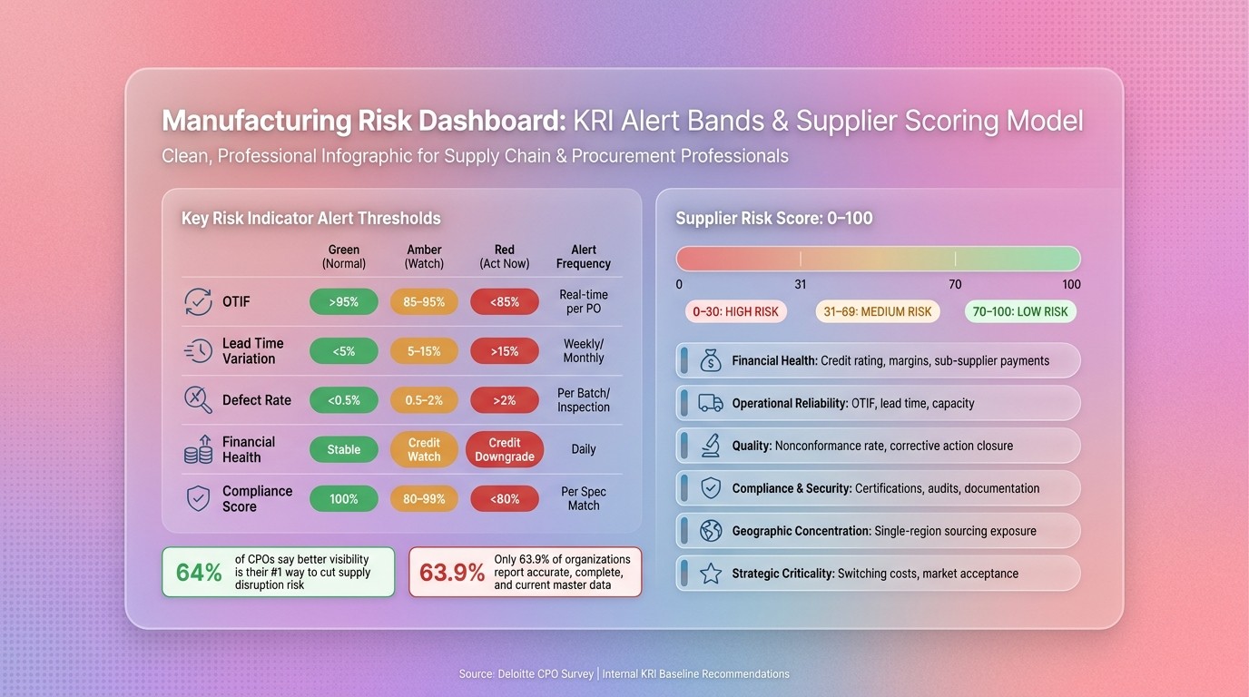
Manufacturing Risk Dashboard: KRI Alert Bands & Supplier Scoring Model
Configure Thresholds, Severity Bands, and Alert Timing
With your KRIs in place and your dashboard set up, the next job is simple: turn signals into action.
Set thresholds that separate normal variation from actual risk. Then route alerts based on how fast each signal can hit production. If a metric can hurt the line fast, the alert needs to move fast too.
A practical setup uses three bands:
Green for the normal operating range
Amber for watch
Red for immediate action
These bands should come from your own historical baselines. That way, the dashboard reflects the way disruption shows up in your operation, not just a fixed target on paper.
Alert routing should also be automatic. Critical signals need to reach the right owner right away. Timing matters here. OTIF failures and financial events like credit downgrades or delayed sub-supplier payments belong in real-time monitoring. Slower-moving signals, such as lead time variation and defect rate, can run on a daily, weekly, or per-batch cycle based on how fast they affect the line.
The table below shows common early-warning bands for supplier reliability and operational KRIs:
KRI | Green | Amber | Red | Alert Frequency |
|---|---|---|---|---|
OTIF | >95% | 85–95% | <85% | Real-time per PO |
Lead Time Variation | <5% | 5–15% | >15% | Weekly/monthly trend |
Defect Rate | <0.5% | 0.5–2% | >2% | Per batch/inspection |
Financial Health | Stable | Credit watch | Credit downgrade | Daily financial feed |
Compliance Score | 100% | 80–99% | <80% | Per specification match |
Review these bands on a regular basis so they stay tied to current baselines and current disruption patterns.
Once the thresholds are set, each alert needs a clear owner and a clear response path.
Build a Supplier Risk Scoring Model Teams Can Trust
A score no one trusts is worse than no score at all.
The best way to build trust is simple: make the score transparent. Every number should tie back to a specific, verifiable data point. No black-box logic. No mystery math.
Use a 0–100 composite score based on the risks that matter most to your operation. Common inputs include financial health, operational reliability, quality, compliance, geographic exposure, and strategic criticality. Weight each dimension based on exposure. For example, a single-source critical part should matter more than a commodity item.
Use this scale:
70–100 = low risk
31–69 = medium risk
0–30 = high risk
Risk Dimension | Key Indicators | Weighting Approach |
|---|---|---|
Financial Health | Credit rating, operating margin, delayed sub-supplier payments | Recalculate on financial change |
Operational Reliability | OTIF, lead time variation, capacity, local support availability | Weight heavily for critical parts |
Quality | Nonconformance rate, corrective action closure rate | Increase weight where defects can stop the line |
Compliance & Security | Regulatory certifications, audit results, documentation gaps | Use pass/fail thresholds for mandatory requirements |
Geographic concentration | Single-region sourcing, geographic exposure | Increase weight when sourcing is constrained |
Strategic criticality | Market acceptance, peer interest, switching costs | Use as a secondary factor for long-life parts |
Recalculate scores whenever new operational or financial data comes in.
Then connect each score to the parts and purchase orders it can disrupt. That’s where the score starts to mean something to buyers, planners, and plant teams.
Use Part-Level Risk Views to Show Production Exposure
Supplier scores show who is at risk. Part-level views show what that risk does to production.
Link supplier performance data straight to the parts, SKUs, and purchase orders they support. That gives buyers a direct view of which items are exposed when a supplier moves from green to amber or red. It turns a supplier warning into something concrete: Which part is at risk? Which order is exposed? How close are we to a line issue?
Part Category | Key KRIs | Example Trigger Level |
|---|---|---|
Single-Source Items | Supplier Financial Health, Lead Time Variation | Any credit downgrade or >10% increase in lead time |
Long Lead-Time Parts | Sub-supplier Payment Status, Shipment Delays | Any reported sub-supplier payment delay |
High-Volume SKUs | Days of Supply, Defect Rates, OTIF | <10 days of safety stock or >2% defect rate over 30 days |
Critical Components | Residual Risk Score, Geographic Concentration | Credit rating downgrade of primary manufacturer |
Keep inventory coverage, supplier health, and production exposure in one view. When teams can see all three at once, they can act before stoppages spread.
That exposure view then feeds the next step: compliance checks and response workflows.
Turn Alerts Into Action: Compliance Checks and Team Workflows
Embed Compliance Checks in Supplier and Item Monitoring
A risk score means nothing if no one acts on it.
Once a supplier or part turns amber or red, the dashboard should do more than show a warning. It should check compliance and kick off the next step. Build specification compliance, certification status, and evidence checks right into supplier and part views. If documents are missing, certifications have expired, or specs don't match, flag the issue on the supplier and on every linked part before a PO goes out.
Just spotting a problem isn't enough. You also need proof. Every compliance claim should link to a specific source, such as a certificate PDF, audit report, or test result, not just a supplier's word. That's what makes the record defensible.
Create a Risk Register and Response Workflow for Each Alert
Every critical alert should land in a risk register with a clear owner, due date, root cause, mitigation action, and review status. That gives teams a way to track work without chasing updates across email, chat, and meetings. It also gives leadership a live view of open risk items.
Escalation rules should be set from day one. Each alert type needs its own response path. A critical delivery risk should go straight to plant-level leadership. A drop in financial health should pull in procurement and finance that same day to look at backup options.
Here’s how common alert types map to workflow steps and owners:
Alert Type | Workflow Step | Primary Owner |
|---|---|---|
Missing/Expired Certification | Automated request for updated documentation; block new POs if critical. | Compliance Officer |
Specification Mismatch | AI-assisted technical review to flag gaps; initiate vendor clarification cycle. | Engineering Lead |
Financial Health Decline | Trigger financial audit; identify and pre-qualify alternative "Plan B" suppliers. | Procurement Manager |
Critical Delivery Risk | Escalate to plant-level leadership for contingency planning. | Operations Manager |
Regulatory Non-Compliance | Immediate escalation to legal; review data residency or privacy clauses. | Legal and privacy lead |
When mitigation is complete, record what was checked and why the issue was closed. That keeps the file ready for an audit.
If mitigation calls for a fast substitute, route the alert into AI-assisted specification review.
How AI Tools Like Procright Support Specification and Compliance Review

When an alert pushes a team to find another part or supplier, the hard part usually isn't finding options. It's checking them fast enough to avoid slowing the line. That's where AI-assisted tools help.
Procright supports this part of the workflow by automating the specification work that often holds teams up during mitigation. Instead of starting with a blank page, procurement analysts can use Procright to review a category, find viable alternative products, and see transparent compliance scores tied to specific lines in the specification. Each score includes citations back to source documents, not unverified supplier claims.
The platform scores products line by line against requirements with clear Yes/No/Partial indicators. That lets quality and engineering teams see exactly where a candidate product matches the spec and where it falls short. AI-assisted specification and comparison work can reduce errors by 90% and cut major purchase decision timelines from 16 weeks to under 7 days. When a supply disruption is already underway, that time savings matters.
Each mitigation action then becomes part of a traceable record that feeds leadership reporting.
Report Risk to Leadership and Close the Loop
Build a One-Page Executive View With Business Impact
Once alerts are routed and mitigation starts, leadership needs a plain-English snapshot of business exposure. They don’t need a wall of charts. They need one view that shows exposure, business impact, and what’s being done about it.
The goal is simple: show exposure, dollar impact, and production risk. A one-page executive view should let leaders grasp the situation in seconds.
Keep it to six core metrics, each tied to a business result:
Metric | What Leadership Should Read From It |
|---|---|
Composite Risk Score | Overall supply base health; shows whether the organization is trending toward or away from risk thresholds. |
Spend Concentration | Percentage of total spend tied to high-risk or single-source suppliers; highlights "all eggs in one basket" exposure. |
Production Capacity at Risk | Volume of output dependent on suppliers currently flagged as high-risk; directly correlates to potential revenue loss. |
Open Compliance Issues | Count of critical regulatory, safety, or ethical gaps; indicates legal and reputational exposure. |
Estimated Cost Impact ($) | The dollar value of potential disruptions, including downtime costs and risk-adjusted total cost. |
Trend Over Time | Visual indicator of whether risk exposure is increasing or decreasing based on mitigation efforts. |
Under those metrics, add three short notes:
What changed
What mitigation is underway
What remains open
That extra context turns a scorecard into something leadership can actually use to make decisions.
Set Review Cadence, Ownership, and Dashboard Governance
After leadership reviews the dashboard, assign actions and feed the results back into scoring. Without a set review schedule, a dashboard turns into a static report that people stop trusting.
Set a monthly cadence for procurement, quality, supply chain, and operations to review open alerts, confirm ownership, and check whether mitigation actions are moving as planned. Review KRIs quarterly. Drop weak indicators, and add new ones when suppliers or regulations shift.
Visibility means little if nobody owns the signal. Give every KRI a named owner - not a team, not a department, but one person. After each review, log the action, owner, and result. Then feed that outcome back into supplier scores and thresholds. From there, tie dashboard outputs to sourcing decisions, mitigation budgets, and supplier development plans.
Key Takeaways for an Effective Manufacturing Early Warning System
The best dashboards close the loop from alert to action to updated thresholds.
They tend to share four traits. First, they focus on a small set of high-value KRIs. Second, every alert links to a workflow with a named owner. Third, suppliers are scored the same way each time, and part-level views show which components sit behind high-risk suppliers. And most of all, risk is reported in business terms - dollars of spend at risk, revenue exposure, production capacity affected - so leadership stays engaged and the dashboard drives decisions instead of just documenting problems.
FAQs
How do I choose the right KRIs?
Choose KRIs that fit your manufacturing procurement risk profile and day-to-day goals, like product maturity, market acceptance, and technical compliance scores.
Start with your procurement specifications. Look at the line items that matter most, assign an importance level to each one, and score products against those requirements. Then mark whether each item shows partial or full compliance.
That gives you a clear, data-based, auditable early warning system instead of a gut-feel check.
How often should the dashboard update?
For an effective early warning system in manufacturing procurement, the dashboard should update in real time. That way, your team can spot changes in supplier status, compliance risks, or possible failure points the moment they happen.
Those live updates make it easier to catch small warning signs early, while there’s still time to step in before they turn into major supply chain disruptions.
What data do I need to start?
Start with a clear, complete technical specification. That document is the base for risk monitoring and vendor assessment, so it needs to be clean and settled early.
You can upload specs you already have, or pull older documents together into one file. The goal is simple: give everyone one version to work from instead of a messy stack of notes, drafts, and old attachments.
If the requirements still have holes, Procright’s AI agent can help spot gaps. After the requirements are final and everyone agrees on them, assign importance levels to the key items. That makes it easier to sort your risk dashboard and focus vendor evaluation on what matters most.